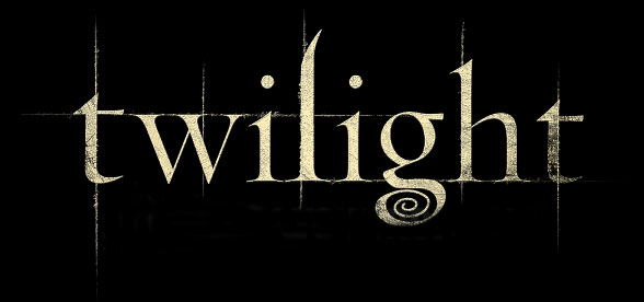
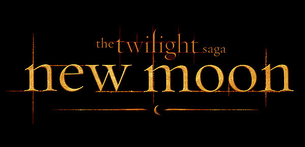
The people at Summit Entertainment have posted an incentive to get people to follow the new @Twilight official Twitter page: when they reach 200,000 followers, they will reveal the ECLIPSE movie title treatment! A title treatment, for those who don’t know, is how the movie title font and placement is set up. For example:
I can’t wait to see what color it’s going to be (I’m guessing green?). All they need is about 105,000 more followers! You can follow the official Twilight Twitter page here.


19 Responses
Maybe It will be red this time.
Then breaking dawn will be white. 🙂
Just my thoughts.
I don't know why but I always pictured the Eclipse one blue, sort of a light blue or ice sort of color, idk why, lol
I just can't wait to see it 🙂
I think it will be Red or Blue
I think it'll be the color green or purple, or possibly red. I think that if Eclipse is red, than Breaking Dawn will be either black or purple. But I don't think Eclipse should be blue–Twilight was already a whitish/icy blue, right? I don't think that they should repeat colors.
I totally agree with Lais Baptista, I think it will be red or blue.
red or blue for fire and ice!!
i think that gotwilightyay is right about the purple or green. i definitely don't think it will be white because that would look too much like the title of twilight. BTW, how the heck are they going to make BD anyway? RP will be like forty by the time they're done.
LOL, true claire true,
I think it will be brown or close to brown, idk why
but the color i chose is not one anybody has chosen yet…
does that make me weird?
oh and for breaking dawn, i think it will be light green, brown, or a dark purple mixed in with dark red.
again idk why…
i guess those are the colors i think of when i think of isle Esme and Renessme.
=D
With everything that goes down in Eclipse, it better be read. Breaking Dawn should be like white with purple edging or something. A unique color.
the titles for twilight and new moon just look like unfinished work…
you know, with the grid lines kind of showing…
it bores me…
they should get some super fantastic stuff for eclipse…
i'm thinking star trek font… except not…
I'm hoping it will be RED for Eclipse. After all, it is the darkest/bloodiest of the series 😉
im guessing red!! i dunno why, i think it has something to do with Victoria's hair :/
i think its going to be orangey or red
thinking of eclipse colours and the sort
of neutral colours summit picks for the titles 🙂
I'd guess they would make the Eclipse logo red… idk
Guess red too..
It is going to be red because on the first movie poster the rim around the half moon is silver and red as well as the 'P' . I think Taylor suits the Role of Jacob.
It is going to be red because on the first movie poster the rim around the half moon is silver and red as well as the 'P' . I think Taylor suits the Role of Jacob.
Ive been absent for some time, but now I remember why I used to love this site. Thanks, Ill try and check back more often. How frequently you update your site?