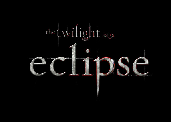
Here it is, courtesy of the official Twilight Twitter!
Was anyone expecting the colors to be silver AND red? I think it’s awesome! It looks far more like a traditional vampire movie with these colors, and I think it’s probably the best logo from all three of the films.


31 Responses
oooooo i like ^_^
i had a feeling red would be incorporated
somewhere in this title, it just had to be! 😛
I love the eclipse on the “P”… clever 🙂
Yeah! it's really cool and on the p you can see an Eclipse 😀
I like it but the lines seem a bit overkill on this one. Maybe it's because the colors stand out more, therefor the lines do too? I don't know. I liked the New Moon one best so far.
That could just be me, though. I'm picky.
it is really cool I kinda love it. It sticks to the authenticity of the books I find! <3
Kaleb, quite a few people have been saying it is like the Fire and Ice theme. The silver kind of looks frozen, and the red is peeking out. I'm thinking about Jake's line that went something like “but I can't fight with an eclipse.” The red is trying to win, but the silver is the dominate feature.
Haha, red! I was right =O
wow. now THAT is cool.
but i was thinkig brown.
but the the silver looks sooo cool, it looks like metal!
RED!!!! It looks awesome!!! its probably the red that makes it look more vampire-ish
I TOLD U ITS GOING TO BE RED , didnt I?!! lol love it
Ooh, shiny.
I like.
Oh, and Kaleb, we made purple smoke in my Chem class a few weeks ago.
Just thought you should know. =P
I think megster1992 explained it really well and I was thinking along those lines 🙂 I think the lines are unnessisary because the new moon title has them and that destinguishes the new moon title from the twilight title besides the colour. If they did something different than twilight and new moon I think that would have been even better. (sorry if that was kinda confusing) but I still lOVE it! Btw follow me on twitter @emily_melanson
PERFECT!!! kaleb, do u no that new moon has already been leaked?!?!
Oh? Can I have the link 🙂 ^^
Its an interesting treatment.. I agree this looks more traditional scary vampire type of font use. I do like the touch of the fire and ice theme to the P… including the point of light that happens just as the eclipse is almost complete or starting to end.. Very much a reflection of Edward and Jacob in this.
I love how there's like a shine on the “p”
Ooh! Super epic! Love the silver! Isn't Eclipse supposed to come out in June?
Anywho…
Hey I just wanted to tell you Kaleb that I am now hooked on Owl City. Thanks a lot… LOL!
wow i never thought of it like that
but now that u mention it
I totally agree
You know what? I really like it. yeah, I was expecting red somewhere, but the silver's cool, too. And the eclipse.
thats supposed to be an eclipse if u look closely, it looks like a round ball so its the sun so its an eclipse! lolz
WHERE????????????????
i no right? totally!!!!!!!!!!!!!!!!!!!!!!!!!!!!!!!!!!!!! i cant wait for this movie to come out
That is downright sexy! ;-). Eclipse is my favorite book, so it's most fitting it has the most BA title treatment. Silver, red and black looks freaking sick!
I actually thought it would be silver! I just didn't expect the red…but I get it, it's like the poem in the book, Fire and Ice… Jacob and Edward.
I have one thing to say about this…
Idon'tcarelol :3
twilight is the best movie i have ever seen,
The 'Twilight' logo had the lines too so it doesn't distinguish the 'New Moon' title from the 'Twilight' one.
ahaha i totally realize that AFTER i wrote my comment 😛
I'm soooo excited for this movie. I'm one of those strange people who fav in the series is the one no one really remembers (psss…if you havn't guessed it's eclipse) Like I've talked to several fandom people and when I declare (yes people do still declare) that Eclipse is my favorite all have asked me what happened in that one… there is also a major plus that Eclipse comes out on my birthday!!!
love it…i cant wait!!!
love it…i cant wait!!!