As announced on MTV blogs, the upcoming NEW MOON movie now has a NEW NAME. Well, not quite new, actually it’s the same name but now with ‘The Twilight Saga’ added to the beginning of the logo art:

People have been asking my opinion on the longer logo and why it was changed from just NEW MOON. While I don’t have an exact nor official answer, I do have my own theories.
Followers of my site might recall that the full title of my book is Bran Hambric: The Farfield Curse, and this follows the same concept I think they are using for New Moon. In my case, BRAN HAMBRIC is the name of the series, and THE FARFIELD CURSE is the name of the specific book in the series (for example, the second book might be called Bran Hambric: The Lofty Pantaloons or similar). This is the same with almost any series of books or films these days, and is basically a good marketing technique as it connects each movie or book back to one main concept (like, every Harry Potter having Harry Potter in the title; every Percy Jackson book having Percy Jackson in the title; and now every Twilight Saga movie having Twilight somewhere in the art).
The fact is, the most recognizable book in the series is Twilight: people always remember the hands and the apple, and the extra-tall letter L. So, by putting Twilight into the art of this poster, all the people who are only fans of the films will connect the films together, and go watch it.
Plus, The Twilight Saga isn’t actually going into the full official title: it’s just there for the less-dedicated fans (like in Star Wars: the films were referred to A New Hope / Return of the Jedi, but were actually officially titled Star Wars: A New Hope, etc.). However, this leads to the question: does it actually look good in the new way? Does the gold really stand out enough and make the movie unique?
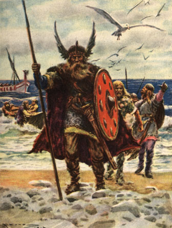
I will be honest about certain flaws I see in this logo. For one, it is ginormous, with not one, not two, but four layers (The Twilight Saga, New Moon, the Moon device, and the release date). With Twilight, everything was wonderful and compact. I’ve worked in graphic design for years, and I know that a compact logo is far better than a big and bulky one. Also, I loved the mysterious blue for Twilight: the New Moon logo seems stronger, deeper, almost like it might be a new movie about Vikings

On the other hand, though, they were really smart in regards to the marketing I mentioned above: and with the budget they’re putting into this film, I have little doubt they did all of this for a reason. Keep in mind that New Moon focuses greatly upon Jacob Black, and I have a feeling that the gold here was made to contrast as deeply as possible with the blue in the previous film. Edward and vampires are more mysterious and cold: Jacob and the werewolves are more strong and warm. Compare the color schemes for the two films. Now it makes more sense!
Question for the comments: What do YOU think about the new logo for New Moon?
103 Responses
Its a little dull in the coloring but its ok??? Cant wait to see what they do for the eclipse I think red would be a good idea. 😉
I have to agree that it’s a little bulky. I do like the color. Still, this is NOT the hype that MTV made it up to be. I was expecting a promo shot or something. Lol. I saw this and was just bored with it.
except now the harry potter movies say HP 6 instead of harry potter and the half-blood prince.
Actually, according to HGE the title is just “New Moon” check it out:
http://hisgoldeneyes.com/index.php?subaction=showcomments&id=1235171684&archive=&start_from=&ucat=&
I’ll get used to it. I’m not completely opposed or anything. The lines everywhere make it a little more busy than I’d prefer. At the moment, the moon underneath the title is bugging me. I know that sounds picky, but “new moon” means there is NO moon. So do they really need that there, adding to its enormity (as Kaleb put it)?
(It’s not actually this late where I live, by the way.)
Well, I think it’s very similar to the logo of Twilight with the lines and the style of letters; but it’s ok for me.
they announced its just “new moon” later after. heres the article http://www.eonline.com/uberblog/b100852_new_moon_gets_official_title_artwork.html
Just a fun fact: in France, the first movie was called “Twilight, Chapitre 1: Fascination” (Fascination being the French title of the first book) ^^
I think its bulky and awkward. Also having been in graphic design for a while, this logos bugs me.
One of the things I don’t like is the lack of caps. That worked for the Twilight logo because the words begins and ends on the same letter. For this logo I feel it leaves a sense of incompleteness.
Well… that color and this font makes me think I am looking at cheese cookies..
I agree with the Edward/Jacob thing. The color suggests that the movies will be similar, but that the focus is shifted from Edward/vamps to Jacob/wolves. The only thing I have a problem with is they need to blend the New Moon text in with the light streaks a little more. The great thing about the Twilight title was the artistic feel of it. Here it seems like a cheep computer imitation of a drawing.
I think you got the nail on the head. When I first saw the logo I thought the same things- color new (but I liked it), too many layers, and the Twilight addition made sense for people who don’t know the books as well as the devoted fans (like myself… lol.)
love your thoughts on the detail and decision of the colors. What do you think they will do for Eclipse, Kaleb? You should send in some advise… I’m sure produces would love your opinion!
.Emma
I agree. The orange and blue represent very well the fire and ice analogy that is constantly and recognizably used for Jacob and Edward, respectfully. I think they should use red in the title for Eclipse because of the newborns. You know, because they’re eyes are red, and they have the whole thirst-for-human-blood thing? And I don’t know, maybe white for Breaking Dawn. Because of the wedding, and like on the cover the small red pawn Bella being transformed into the strong, white queen piece Bella. And I like the crescent moon in the title, I just think maybe it should be in a different place, like hanging at an angle over the title or something.
I love the logo 🙂 i expecially like what they did with the moon crest addition. although the new moon signifies the dark period of time Bella goes through without Edward, I like how they snuck in a little Jacob in there 🙂
i love the gold too, the color is a great choice in my opinion. and i don’t mind all the extra info haha that’s my opinion 🙂
THANKS FOR POSTING KALEB (h)
I absolutely love it
(mostly because its finally something to do with the new moon movie!)
and because i think it looks awesome.
i agree with some people… red for eclipse!
cant wait till Oscars
yayz… go rob! lolz!
It’s a bit busy in comparison to Twilight’s logo. I’m a great fan of the KISS rule (keep it simple stupid). I think that the line with the moon separating ‘new moon’ and the release date detracts from the design, and also places too much emphasis on the horizontal.
I also agree with you Kaleb, that it’s vitally important to reference the twilight ‘saga’ in the title.
I’m not exactly pleased with it, but I’ll get used to it.
That moon IS bugging me, though, do you think we should petition Summit to remove it? Haha.
I like it 😀 Not really much more to say…
When I talk with friends about Twilight, I often tell them that New Moon will be released in November in the US. And they often look at me strangely, like if I’m talking chinese. So, I have to explain them that New Moon is the sequel of Twilight. That’s why I agree with you when you say that it permits the “non twilighters” to recognize the movie as part of the Twilight Saga, and that it has to be in the title. But with Breaking Dawn, it’s gonna be a quite long title 🙂
Concerning the golden letters, I didn’t think about Edward/Jacob, though it’s a great idea. I think that maybe, it has something to do with the meaning of the words themselves. I mean, “twilight” evoke the beginning of the night (or the end, it can be both actually), and so, a blue light ; “new moon” makes think to the glow of the moon, so, a yellow/golden one. That’s why I think they should put “Breaking Dawn” in red 🙂 But that’s only my theory, and I can be wrong.
Now, I wonder how they’re gonna translate it in French, or in Spanish, or in any other foreign language. Even the books’ titles are different…
Here’s the end of my (long) commentary. Sorry about that. And sorry for my English which can be terrible sometimes 🙂
I like the logo. It’s exactly what I thought it should look like. It incorporates the twilight font, which I think looks really cool. I agree they needed to include the twilight saga to tie all the movies together. When I saw it, I got soo excited for the movie!
Please remember that nameing books with names such as Bran Hambric: The Farfield Curse , make it very clear that that is the first books. Titles like that suggest that there is a book before it.
By the way, T can’t wait till you book comes out!!!
Oh, and I forgot to say that I like the logo but have seen better.
I like the logo but i dont like the little moon at the bottom… you can’t see the moon when it is in new moon phase!
Looks like summit needs to go back to the 7th grade…
Except for what you said about it being to bulky and what SnowWight said about the moon, I like it. I completely understand why they put the Twilight saga in the art, and as many people have said, it’s technically not part of the title.
For Eclipse, i think they should do either red or green, because they spend so much time in the forest, and red because….. there’s a lot of blood.
I think the new logo is ok. When I first saw it, I though there was too much going on. It is kind of bulky. I like your little theory on the colors of the letters.
I like it, even if it is a little big. and the cresent moon, what’s up with that? it’s supposed to be NEW moon, lol.
I like the color, it’s like Edward’s eyes… except, you know, Edward isn’t in it much so your theory is better.
I think (assuming they change title colors each time) Eclipse will be green and Breaking Dawn’ll be red. BD should be red.
I think the logo is good, a bit busy alright, but I like the contrasting colours:) I agree with you as well, it’s as if it signifies Edward and Jacob.
And ‘cos I didn’t know where else to say this: I added your button to my blog, and mentioned you briefly-just agreeing with you….I’m not really sure about blogging etiquette:P here’s the link as proof. Its only a short thing anyway.
It’s okay, I guess. Could be better.
I like how they kept the same font. But honestly, I don’t see what everyone’s freaking out about. It’s just the title….
oops here’s the link: http://glitter-in-my-hair.blogspot.com/2009/02/new-moon.html
I like the logo/artwork and totally get ur analogy concerning the blue and orange colors. How the blue relates to Edward and the orange relates to Jacob. But I totally don’t get the Vikings analogy!!Also~ I LOVE ur sight! Thanx for all the updates!!!
Ahh! You know what Percy Jackson is! Haha I used to love those books 🙂 And the title really isn’t important to me, so I’m good 🙂 Hehe 🙂
I think it’s pretty good. I mean, I can’t think of how I would have prefered it, so I’m not complaining about anything
This sounds oddly like the same things we discussed last night in chat. LoL
As I said then, I kinda like the longer title. It makes it seem more majestic. I’m also sure it’s aimed at the non-readers, so that they will realize that it’s a sequel. It surely sounds better than Twilight II: New Moon.
I think you may be reading a little too much into the colors; I think they’re just trying to make it different. Eclipse will probably end up purple or something.
i absolutely love it and think it’s good as the orangeish color bc like you said new moon is mostly about jacob and he’s warm where as edward is cold.
wow, when I first saw it I immediatly thought,”Wow…its orange!” but I’d rather think of it as gold. I like how the color is more original and new than the same blue. It makes sense since New Moon is a new experiance for Bella and I think the color shows that in some way by contrasting with the basic blue. It definatly promises change.
I really like it. It makes the movie seem like it’s going to be seriously EPIC. And it is for us! lol and I think it will attract alot of attention. I like how you compared the colors with the Vamps and wolves. It makes sense. I think this logo will look really good with the catch phrase “It will be as if I never existed.” I mean I can see the trailer now: It starts out in the parking lot with Alice telling Bella happy birthday. Then you go to an upset looking Edward bringing bella into the woods saying “we need to talk” or something like that. It can show bella laying on the forest floor crying and and all different eye catching clips like her on the bike, her with jacob, the wolves, other such exciting clips. and then show her running yelling Edward in Italy. And then for the very last scene she jumps off the cliff and it cuts to the new moon logo and the guy says” The TWILIGHT saga’s *epically spoken* NEW MOON. and you here Edward say “It will be as if I never existed”.
This movie will be awesomeness!
Oh I forgot to mention also that I do like how the moon looks but it doesn’t make sense. “new moon” means no moon so I don’t see why they put one. lol I like it anyway
Okay, I especially LOVE Hunter Vala Cullen’s trailer. I even spoke the words like the announcer.
I actually agree with your analogies. Edward is cold, and blue is a cool color. Jacob is hot, and orange is a warm color.
The only thing that bugs me pretty much bugs everyone else. The moon. In a new moon, there is no moon. All well, I guess we’ll have to see what they do with it.
I kinda jumped around on my sofa when it came on on ET (I think it was ET…). Anyways, I think it’s cool, I liked how it looks like someone scratched it up. But, phail. The moon on it is not New, but Waning Crescent (I think…)
I’m just happy that a) they kept the same font and beam-things through the letters and b) they didn’t change the name to something ridiculous, like, “Twilight and the New Moon-Howling Werewolves.”
You know what’s occured to me today?
Today I officially became the proud owner of every twilight poster available in Scotland. This led to wondering if I was gonna end up going on my quest all over again once Crescent Moon is released (I will call the movie New Moon again when the Crescent is removed. I know I’m being childish, but I don’t care).
Aaah, the money I will spend on merchandise…
Grr. The moon they put on it bugs me! THAT’S NOT A NEW MOON! Well, I like the color immensely, and the intention of the moon was clear… It was a nice effort. But what colors should they use for the next movies? I wish they had made New Moon green, kind of woodsy, like Jacob. GRRR. Sorry. I get the whole Jacob’s warm, Edward’s cold thing, but New Moon being orange ruins the colors I imagined for both Eclipse and Breaking Dawn.
I like that they have “Twilight Saga” at the top. I think it’ll help those who aren’t obsessive about the series to figure it out and connect it. I like the coloring too. And your idea about the colors describes it perfectly!! I don’t like the little moon thingy.
But all in all I love it!!
OOH i agree with #44’s comment. Green would have been better for New Moon. And then…… red for Eclipse. and……… yellow for Breaking Dawn………. 😀
Oh and #38 Hunter Vala Cullen’s idea for the trailer is amazing. I got shivers when I imagined that last line. I will probably cry if they do something like that. “It will be as if I never existed.” Such an epic end to the commercial. I am soo amazingly excited for this movie now!!
I’m glad people aren’t completely freaking out over it, because it’s not a big deal. Sure, I think the title is lame but apparently it’s not even official..? Even if it is, we’ll all still call it New Moon anyway.
As for the logo being big.. I agree. It’s kind of too much, but it won’t effect the movie, so for once I actually don’t care
I like it. I just don’t understand why they have that moon on it??
I think it would look much more aesthetically pleasing and compact if the moon and lines under “new moon” were omitted. I’m happy they keeps with the lower case though.