As announced on MTV blogs, the upcoming NEW MOON movie now has a NEW NAME. Well, not quite new, actually it’s the same name but now with ‘The Twilight Saga’ added to the beginning of the logo art:

People have been asking my opinion on the longer logo and why it was changed from just NEW MOON. While I don’t have an exact nor official answer, I do have my own theories.
Followers of my site might recall that the full title of my book is Bran Hambric: The Farfield Curse, and this follows the same concept I think they are using for New Moon. In my case, BRAN HAMBRIC is the name of the series, and THE FARFIELD CURSE is the name of the specific book in the series (for example, the second book might be called Bran Hambric: The Lofty Pantaloons or similar). This is the same with almost any series of books or films these days, and is basically a good marketing technique as it connects each movie or book back to one main concept (like, every Harry Potter having Harry Potter in the title; every Percy Jackson book having Percy Jackson in the title; and now every Twilight Saga movie having Twilight somewhere in the art).
The fact is, the most recognizable book in the series is Twilight: people always remember the hands and the apple, and the extra-tall letter L. So, by putting Twilight into the art of this poster, all the people who are only fans of the films will connect the films together, and go watch it.
Plus, The Twilight Saga isn’t actually going into the full official title: it’s just there for the less-dedicated fans (like in Star Wars: the films were referred to A New Hope / Return of the Jedi, but were actually officially titled Star Wars: A New Hope, etc.). However, this leads to the question: does it actually look good in the new way? Does the gold really stand out enough and make the movie unique?
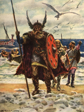
I will be honest about certain flaws I see in this logo. For one, it is ginormous, with not one, not two, but four layers (The Twilight Saga, New Moon, the Moon device, and the release date). With Twilight, everything was wonderful and compact. I’ve worked in graphic design for years, and I know that a compact logo is far better than a big and bulky one. Also, I loved the mysterious blue for Twilight: the New Moon logo seems stronger, deeper, almost like it might be a new movie about Vikings

On the other hand, though, they were really smart in regards to the marketing I mentioned above: and with the budget they’re putting into this film, I have little doubt they did all of this for a reason. Keep in mind that New Moon focuses greatly upon Jacob Black, and I have a feeling that the gold here was made to contrast as deeply as possible with the blue in the previous film. Edward and vampires are more mysterious and cold: Jacob and the werewolves are more strong and warm. Compare the color schemes for the two films. Now it makes more sense!
Question for the comments: What do YOU think about the new logo for New Moon?
103 Responses
I can feel myself getting excited just from #38’s description of a possible trailer! My issue is how focused everyone is on getting through eclipse, with no mention of breaking dawn. Yay! Eclipse on June 30, 2010!!!!
I actually expected something else… but I’m okay with it.
I like the idea of red for Eclipse 😀
I liked the purpleish bluish color for twilight. but now that I think about it, maybe they used that specific color because of an actual twilight, like the time of day. I really hope not because if they’re using gold to be like the color of the moon, then that’s just not good. during a new moon, there is NO moon. it’s the beginning of the cycle and we can’t see the moon.
huh! i never thought about the color connection. now it does make sense why they picked that color.
but what doesn’t make sense to me is the crescent moon. i mean new moon is a phase where you can’t really see the moon. so why a crescent moon?
I dont like this logo as much as Twilight. I think it should have been a little simplier.
‘Less is more’
The orange I’m having mixed feelings about. It’s strong and does fit with the wolvesand the epic feel. But it looks kinda like , i dont know plain. I like how it’s bold. It kind of gives me the feeling of the Volutri instead of the wolves but maybe its the colour.
I love Hunter Vala Cullen’s trailer. Similar to how I imagined it.
Also love the meaning it’s great. I think the Twilight logo stands out more.
oh wow…i never thought of the blue and ‘cold’ of the Twilight logo having to do with the vampires, and then the ‘warmth’ of the New Moon logo having to do with the werewolves. thats good though, if that was their reasoning then at least they really thought about it. it kind of bugs me how the ‘n’ of ‘new’ and the ‘m’ of ‘moon’ aren’t capitilized. but i guess thats just the font, because looking back at all of the books they really don’t have capital letters, do they? it still bothers me though, none the less.
The Twilight Saga is kind of long for it…i mean for fans you just say ‘new moon’ and EVERYONE knows exactly what you’re talking about. but maybe for the people that just want to see the movie they might not have any idea without the ‘twilight’ thing there. in the end, i don’t care what they do with the logo, i guess. as long as the movie is good, then im happy
Personally I think that there is too much writing. Maybe it wouldn’t be as bad if the “Twilight Saga” part was smaller font. I really like the gold for this movie. I think that it turned out fairly well.
i dont like it. its too boring needs more colour…. should be purple, i like purple ^_^
I agree with a lot of people who say the crescent moon is bugging them. And that the whole logo is too… active. Busy. I think that they should work more with smudging the lines, making them more like twilight, blend them in a bit more. As for the crescent moon… maybe they should just replace it with an animal print…! That would be an interesting peice of foreshadowing, to say the least.
i could understand the crescent moon for eclipse, but not for New Moon. that really bothers me
I think what you’re saying makes sense, about the color schemes relating to the characters but the simple fact is that these colors make me think of Halloween and i don’t it should. he color is in between orange and gold, it should’ve been either orange OR gold not in between. It would’ve been good if they remain persistent like HP but it’s all good besides its done. The cresent moon does feel out of place but i get the idea.
I understand why they’d put ” the twilight saga” before new moon, but it’s just when i read the book it didnt say that and i dont know maybe i’m just being weird but i feel like this might change the way the movie is..that probably doesnt make sense but it does in my head lol. I also like what you said about the color schemes. The cullens are a blue because their mysterious. And new moon is about jacob/wolves so that would be a warmer color..nice! lol <3
I actually like it!!!! Wolves gold, Vampires blue!! I love it, I really like it.
i like it!! 🙂 omg im excited!!
Why are you so smart, Kaleb? You must have had good teachers…
Haha, I thought it looked rather massive too, but then it makes sense when I read what you’ve written. The conclusion I came to about the gold is that now the story is turning to La Push and the werewolves/shapeshifters it has to be a lot more earthen. And it’s a warm colour (as you say) which adds to the feeling of safety with it, they seek to protect whereas most vampires live for the kill and all vampires are cold and hard. The gold was a good way to go.
Hey Kaleb! Have you heard about The Twilight Saga’s Eclipse coming out on June 30, 2010. How do you feel about that?
It is bulky-ish, but it’s growing on me. The more I look at it, the better-looking it is to me.
Hmm…sort of like with Rob’s haircut. 😛
OK i like the color (i guess) but its wayyy too busy 🙁 it should just have “new moon” with the lines and no moon and no twilight saga. the moon makes no sense cuz its a NEW moon. i like the lines cuz it carries it on but theres too many! it looks fake and that bothers me 😛 i think that eclipse should be green and breaking dawn should be red.
if all the rest said “the twilight saga” and then the title of the movie underneath i think it would look good but keep it SIMPLE
Finally some people who agree with me about the colors. Blue for Edward and The orange for jacob. Eclipse I see as a Red and well i’m not sure about breaking dawn but thats besides the point.
I think the reason they put so much into this logo is the fact we all were sitting at the ends of our chairs waiting for seomthing New Moon related so they tried to make it big and showy to impress us and well it was great to see but it’s alot to handle.
well i do hate the colour despite the sense of the fact that jake’s warm and ed’s cold.
but i dont think new moon is more about jacob
it IS less about ed(wtf?)
but huh thats okay i guess
i think they have made it darker now
anyways i love the way it sounds u know:
“The twilight saga: new moon in theaters ..blablahblah”
i personaly love the moon its funny but its dorky to use the image that is indicated in the title
so last but not least
kaleb can u plz post sth about Taylor and if he’s gonna be in new moon?
thx
xoxo Abbey
oh and sth else
i think its nice that they changed the colour using the same would be D-U-L-L
and FYI contrast isnt passé
I actually really like the golden color, I love when the moon is that golden color, I always notice it, and it’s always bigger, so it could mean good things, I don’t really consider the release date as part of the logo, it’s just info that will disappear when the movies out so that doesn’t really bother me, but the little crescent moon bugs me, a new moon is no moon so there should be nothing there. I would have gotten nailed in design class if I had tried to pull that off.
I really don’t mind that it was changed because in all honesty, it hasn’t been changed! It is still called New Moon. So what is they added something about Twilight. It IS the second book of the series. My friends and I simply call it by the name of the book. I understand that a lot of people don’t know the names in order or the names at all, so I think that it was an overall good idea. It connects the movies together for people.
Really, it’s not bad.
I think I could live with it.
But really, I had no idea what to expect. My thing is that I wouldn’t have expected it to be gold, since, well, Bella doesn’t exactly feel GOLDEN in this, if you get what I mean…
Oh well.
I understand the warmth for Jacob, but what about the agony of Edward and Bella?
Kaleb, I think your theory is ginormous!!!
I like your thoughts on the colors…
blue = cold, mysterious (vampires).
Orange = warm, stronge (werewolves)
The colors are a great idea to compare the vampires and werevolves concept.
Kaleb, what do you think would be good colors for Eclipse and Breaking Dawn?
I didn’t give the color scheme that much thought. When you put it that way, yeah, that works quite a lot.
What I don’t get, though, is why there is a crescent moon. I thought the phrase “new moon” referred to the time when no moon was visible? Please correct me if I’m wrong, but it’s just awkward, I guess?
what do you think they’ll do for breaking dawn if the use red for eclipse?
i like following your trains of thought, twilight guy..
in reply to kat, i suppose the crescent moon is to signify that there IS a new moon. the tiniest sliver is the beginning of the waxing period of the moon.
it’s still part of the darkest/darker period.
Would you like the logo better if it were slightly asymmetrical–maybe the “Twilight Saga” part flush left, and the date flush right?
I think they should have stuck with New Moon. I think the new logo is way too long. Oh well. I just cant wait to see the movie!!! Even though Edward wont be in it as much as he was in Twilight 🙁
I adore the fact that the Twilight logo was silver and icy, while the New Moon logo is russet. C’mon, people – symbolism within the color scheme was ingenious! As for the layers, I agree that it is too much. Cut the moon, cut the “the Twilight saga.” Leave just New Moon and the release date. The font with the lines is distinctive enough to tie it to Twilight.
i think its fine. i cnt wait for new moon and i love this website!
Well this makes sense so people who don’t know what new moon is can know what it is when it has the twilight saga. I think its a smart move but i like it and i can’t wait till it comes out and the rest of the movies..
ojp1Gh ynlanuczkwas, [url=http://nqiknujihdvd.com/]nqiknujihdvd[/url], [link=http://ossvhzeazqtk.com/]ossvhzeazqtk[/link], http://llxvcqqdpmsj.com/
Eh…it’s okay… not really what i pictured for this movie but…okay so , it’s more like a repeat of TWILIGHT the first movie’s title and since this one is about something completely different I feel the title should represent the book. Ya know what I mean?
IDK… the colors are all wrong for what the book is about.
The books had different color schemes too!
Twilight (the book) was dark, filled with greens and grays. I could see that as I read it.
New Moon (the book) on the other hand was bright and colorful. Like the scenes in Italy, which were in the sun circled with golden buildings and crowds wearing blood red scarves. I’m glad that the movie makers seem to be understanding this. It is one of the things that I love about the two books, the stark contrasts.
Sad to see that the picture of the Viking is historically completely incorrect … Vikings did NOT have feathers or Horns on their helmets … Im Danish I have viking blood in my blood line and at the same time Im a history teacher so I should know 😉
Twilight fans I just want to let you all know about this project where Twilight fans can get involved and help the band “Secrets in stereo” create a song for New Moon. Search YouTube for SECRETS IN STEREO WRITES A SONG FOR NEW MOON (TWILIGHT SAGA) – EPISODE 1 and see how …:)
visit secretsinstereodotcom and Join …Secrets In Stereo for Twilight! …. On Facebook
PLZ Spread the word to as many Twilight fans as possible 🙂
yeah twilight saga sucks vampire don't sparkle only fairies sparkle!! and the story was based on a stolen story.And the girl bell is a drug addict Edward Cullan looks like he has a mental disability.Now the people from Vampire Diaries are better looking.SO THERE FOR TWILIGHT SUCK DONKEY BALL!!!!
yeah twilight saga sucks vampire don't sparkle only fairies sparkle!! and the story was based on a stolen story.And the girl bell is a drug addict Edward Cullan looks like he has a mental disability.Now the people from Vampire Diaries are better looking.SO THERE FOR TWILIGHT SUCK DONKEY BALL!!!!